Interested in Business?
Get Business articles, news and videos right in your inbox! Sign up now.
Business + Get AlertsOne of the most interesting things I was involved in while attending college was going behind the scenes with large corporations and seeing how they create and maintain a solid brand.
Simply doing great work can earn you a living in the septic services industry, but if you want to get to the next level, you need to stand out from your competition and that requires a strong brand. Here are a few tips I picked up while dealing with larger corporations and their branding people.
Consistency
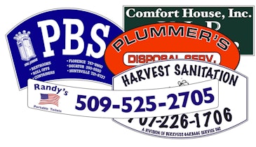
I cannot stress enough how important brand consistency is. It is almost like cheating once you wrap your head around it. Many businesses do a boatload of marketing, but overload and clutter their advertisements with verbiage and details, and don’t always use the same layout, colors, or font. By randomizing your advertisements, you turn your brand into camouflage.
The human brain is very visual and picks up consistencies. I could sit down with 50 slides of different advertising layouts with color schemes and still guess the brand even without the benefit of a logo or listed products and services.
Can you say the same with your business? The layout, colors, types of pictures, logos, fonts and so on are the most important things in brand awareness. The only way to make people call your company is to have brand recognition and be at the top of their mind when their plumbing malfunctions.
Brand vision, tone and execution
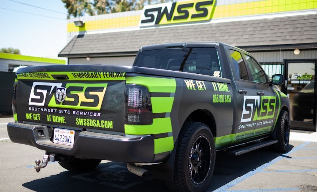
You must look at your brand in two respects. The first is a piece of art. What do you want someone to think of when they see your advertisement, letter, uniform, or van? Strength? Professionalism? Seriousness? Old-fashioned? New and improved? Lighthearted? Good vibrations? Friendly? Hard-lined? You must make everything you do reflect the tone that you want your brand to have and you need to make this come across consistently — the type of font you choose, the logo you select, the colors, the layout of the wording on your van.
Logos and colors
Look at your brand like a professional sports team. What is your logo going to look like and how easy is it to recognize? What is your color scheme going to be?
The most successful brands reap the rewards for being remarkably simple, bold, and easy to remember. The Walmart smiley face, the Apple apple, the Nike swoosh, the McDonald’s arches and the Starbucks mermaid are all examples. You will not find too many easily recognizable brands with intricate and elaborate logos.
You should also consider having logo elements to go along with your main logo. These are smaller design elements that you can use on different types of advertising. Try to limit these alternative logo elements to two or three. For example, if part of your logo has a shield as part of the main logo, you can put that shield on different aspects of marketing where the full logo doesn’t make sense.
Work with a professional on the typeface — a family of fonts — you are going to use and use those fonts on everything you do. Never put out a piece of marketing without first using your selected typeface. Put it on your vans, your invoices, your logo, your press releases, your newspaper ads, your social media pages. Put it on everything; consistency is of the utmost importance.
You should also make sure the details are consistent. Make sure that the width and height of the logos are consistent on every ad.
Design and layout
The layout and design of your media must also remain consistent. Believe it or not, most of the world’s largest brand executives pay more attention to the layout than they do the actual content. Most brand executives do not even work on the “copy” of what an ad says. That is how important the layout is.
As an example, make sure that an 8 1/2- by 11-inch brochure is always laid out with the top three-quarters of the page in a light red, the bottom quarter of the page in a darker red, separated by a very dark red line — the red separating line 0.25 pixels thick spanning the entire width of the page. The logo should be exactly 2 inches wide properly scaled, along with the proper typeface for headings and the body text.
This brochure page would have one alternative variation, and you would make a set of models for landscape format, as well as trifold brochure layout, newspaper-size layout, television layout, invoices, van wraps, etc. for nearly every type of brand ad.
This level of detail is what makes a human brain immediately remember and recognize a company’s brand versus those companies that are running random and ineffective advertisements. No one will remember your special offer, but they will remember your mascot, logo, color scheme and business name if you remain consistent with your presentation details.
About the author: Anthony Pacilla is a registered master plumber for McVehil Plumbing in Washington, Pennsylvania. He has 23 years' experience in the plumbing and HVAC trades, and has a bachelor’s in business and economics from Thiel College.


